Hello! This is Cameron, creator of earth.nullschool.net.
(Special note: At the time of writing, Hurricane Milton is approaching Florida. As always, consult with the experts: the National Hurricane Center at NOAA, local meteorologists, and government officials. earth.nullschool.net should never be used as an authoritative source in life threatening situations.)
Based on the feedback I receive, many of you are asking why the site does not show the same maximum wind speed for hurricanes and typhoons as reported by meteorologists and government agencies. This post will explain why. After reading, you’ll understand why many of your favorite weather sites behave the same way.

some numerical weather model grid examples
Most of the data you find on earth.nullschool.net and other weather sites/apps come from numerical weather models. These are computer programs that simulate the physical processes of Earth as realistically as possible. They can be very expensive computationally and often require supercomputers to reach the level of detail that is useful for accurate weather forecasting.
The Grid
A common approach used by models is to apply a grid to the Earth and simulate physical processes within each cell and between neighboring cells. Many types of grids are used: rectangular, triangular, hexagonal, cubed-sphere, nested, etc. The size and number of cells can vary dramatically.

more numerical weather model grid examples
The density of the grid directly affects the accuracy of the model and the amount of computation required to run it. Grids with larger cells are coarse and thus cheaper to compute, but they have less detail and accuracy. For a finer scale grid with smaller cells, details and accuracy increase but at the expense of greater computational requirements and data size. This is similar to the difference between a low-resolution image and a high-resolution image. The high-resolution image has more pixels and more detail but requires more CPU power to display and takes up more storage space.
These grids are present in the data shown on earth.nullschool.net but are not visible by default. You can see them by clicking the "Grid" button in the menu and selecting "nearest" interpolation from the settings:

settings to make the underlying grid visible
With this mode enabled, dots appear on the globe. These dots are at the center of the grid cells.
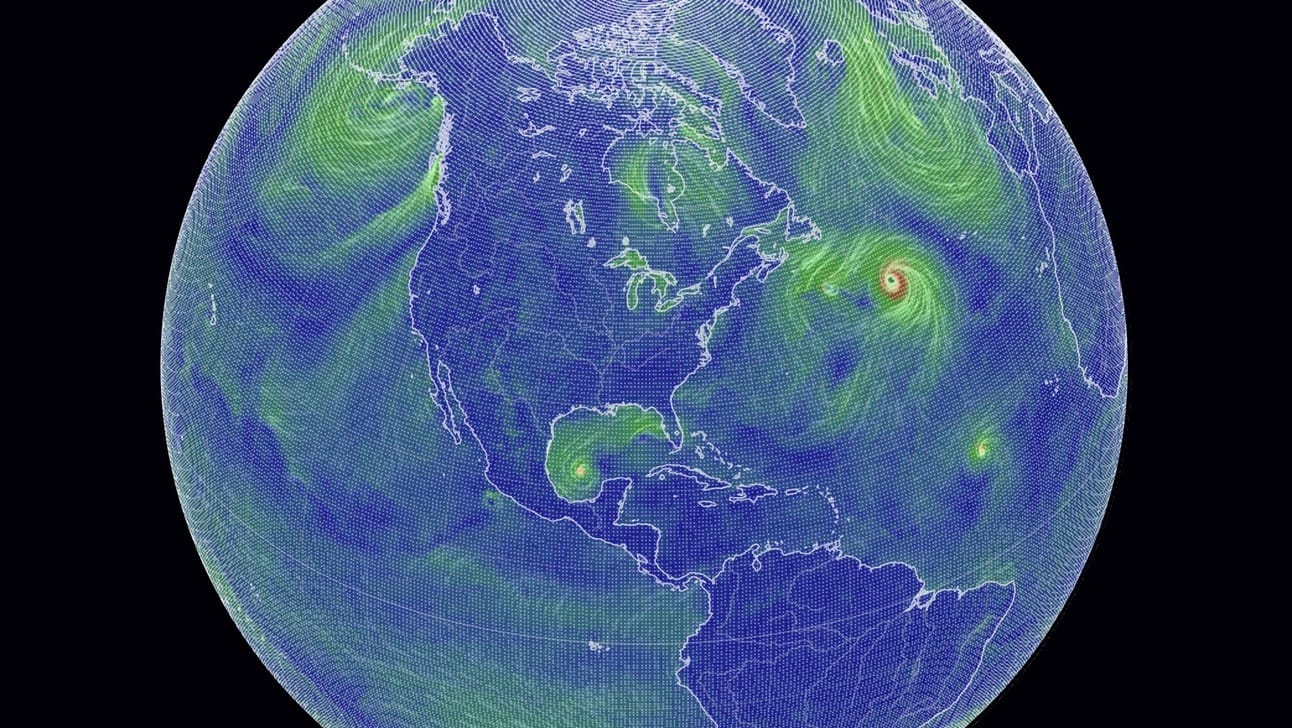
distant view of earth with grid dots visible
When viewed from far away, the grid looks pretty smooth, like a low-resolution photo zoomed way out. The further you zoom in, though, the more "pixelated" the image gets:
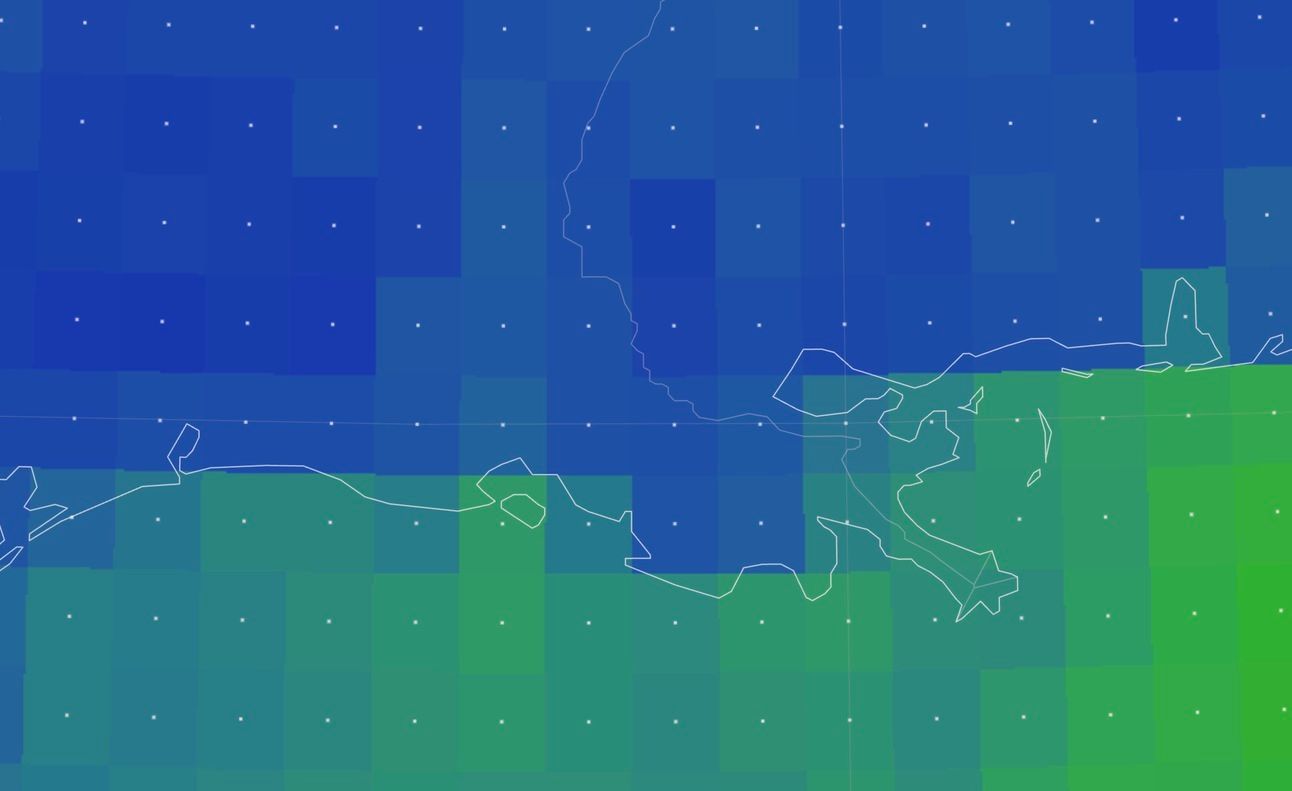
zoomed in view of southern Louisiana where grid cells are easily seen
Zooming in further is pointless. No additional detail can be seen. The only way to increase detail is to use data from a higher density grid.
For some models, earth.nullschool.net shows coarse data by default. This is for efficiency: downloads are kept small and snappy. You can get access to higher resolution data by enabling "HD" mode from the menu at the expense of larger download size. For example:
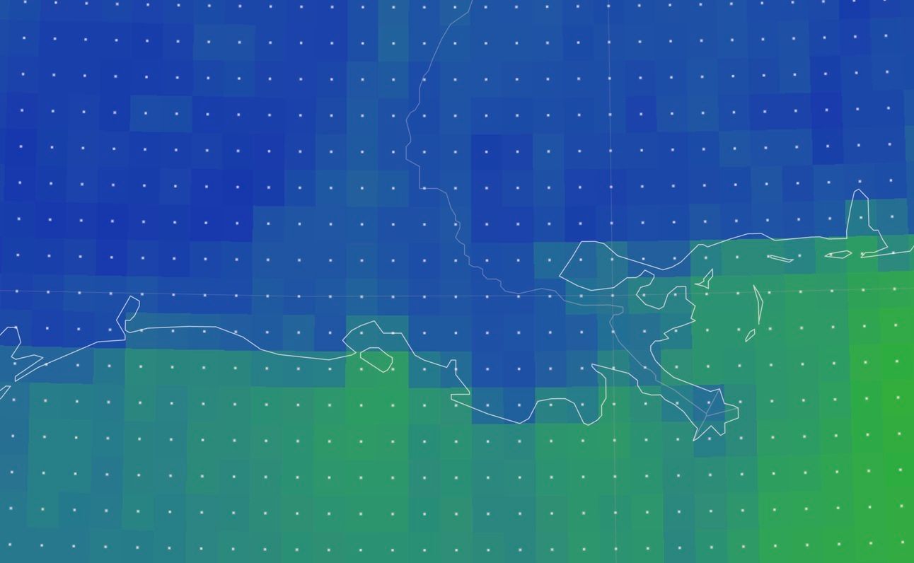
zoomed in view of southern Louisiana showing smaller grid cells
Now cell sizes are smaller and more detail can be seen. Note: only a few layers on the site support HD mode.
What does the grid have to do with hurricanes and typhoons?
Let's take a look at Hurricane Helene on Sept 26th before it made landfall, as modeled by the GFS:

GFS model of Hurricane Helene on a 0.5° grid and 0.25° grid
NCEP publishes GFS model data on a rectangular latitude-longitude grid at three different cell sizes: 1.0°, 0.5°, and 0.25°. Since 1° of latitude is about 111 km, the corresponding cell sizes are 111x111 km, 56x56 km, and 28x28 km. (Note: 1° of longitude decreases in length as you get closer to the poles, but let's ignore that detail for this discussion.)
On a 0.5° grid (the first image), you can just about see the circular shape of the cyclone as a set of reddish and orange squares, but you would struggle to find the eye. The cell with the maximum wind speed shows 139 km/h.
On the 0.25° grid (the second image), the eye is much easier to identify, as is the circular shape. Even though we're at a zoom level where it’s easy to see the grid cells, this looks like a hurricane. The max wind speed is different, too: 148 km/h.
This makes sense because the wind speed for a grid cell is the average wind speed over the entire area of the cell. Smaller grid cells have less area to average over, so intense localized winds have a larger impact on a cell's value. Cell area for the 0.5° grid is 3080 km² but only 770 km² for the 0.25° grid. Quite a difference.
The 0.25° grid is still too coarse to see the most intense, most localized winds. This is why wind speeds are lower than those measured by real planes flying through the hurricane. Hurricane Helene's actual maximum sustained winds were 220 km/h. The GFS does not have a fine enough grid to "see" these winds.
In most cases, average wind speed on a 0.5° grid is perfectly fine for representing common weather conditions. But for the extreme conditions near the eyes of hurricanes, the size of the grid becomes critical to resolving fine-grained details. Specialized models, like NOAA's HRRR and HAFS, use significantly finer grids and (probably?) have the necessary resolving power. Perhaps these are good candidates for future addition to the site.
Bonus: Image smoothing
You might have noticed visualizations on earth.nullschool.net do not look pixelated by default. This is because the grids are smoothed using interpolation.
Here’s how that works. Imagine two people holding the ends of a string pulled taut. One person holds their end of the string as high as they can and the other holds their end close to the ground. Let's assume the string is a straight line, and we know both the heights of each end and the distance between the two people. Then we can estimate (interpolate) the height of the string at any point without having to measure it. It won't be exactly correct—even taut strings sag a bit—but our estimate will be close enough.
We can do the same thing between grid cells using a technique called bilinear interpolation, which works just like the string example but in two dimensions. Returning to our Hurricane Helene example with bilinear interpolation, the results look pretty good:
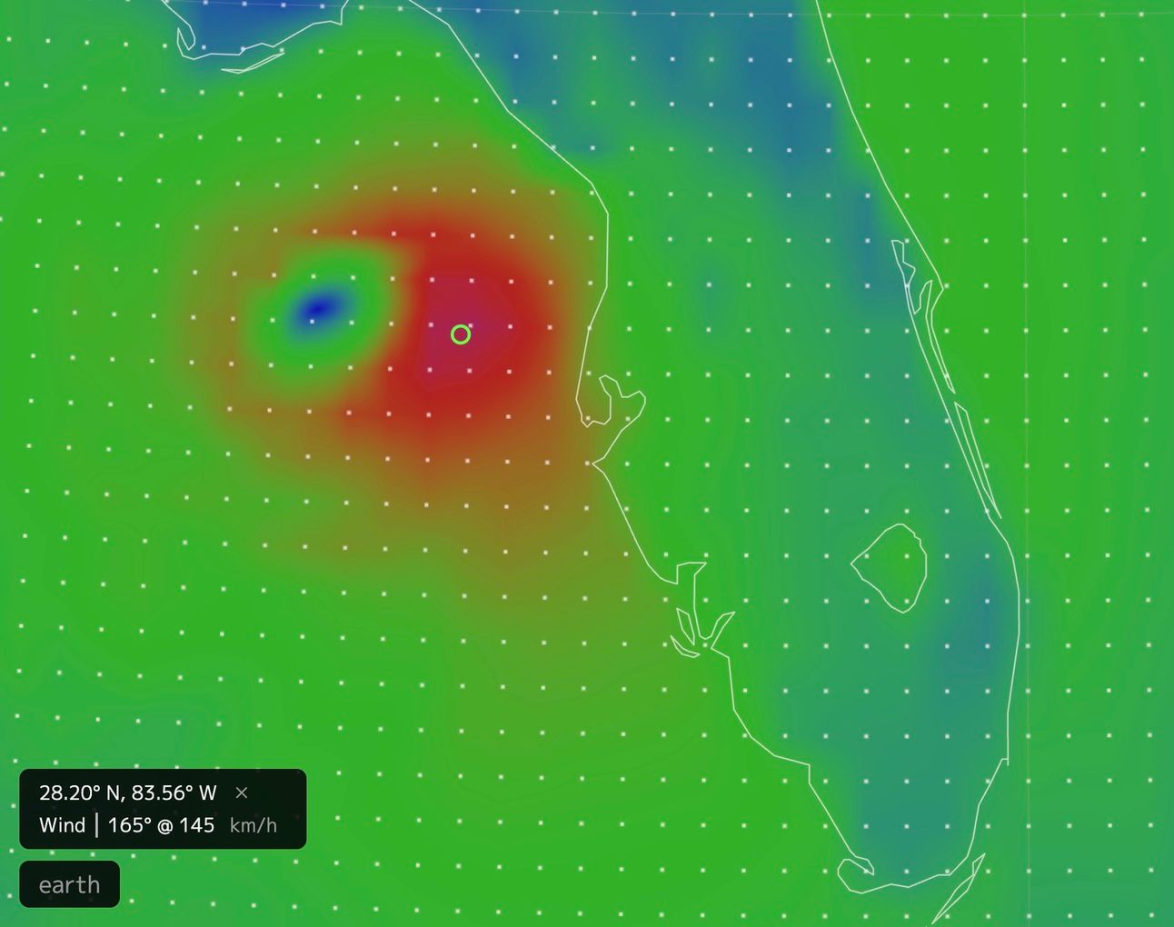
Hurricane Helene rendered with bilinear interpolation, GFS 0.25°
Now the structure of the hurricane really jumps out. But we've made some pretty big assumptions, mainly that the physical property we are interpolating (in this case, wind speed) is similar to the string in that it changes like a straight line between two points.
Don't be fooled: we have not magically created new data. The underlying grid and data points are unchanged. We have simply filled in the space between points with linear estimates expecting the underlying physical phenomena to behave that way.
This… often doesn't work so well:

CMEMS GLO_PHY ocean currents with bilinear interpolation artifacts
This visualization of ocean currents demonstrates the limitations of bilinear interpolation. We see artifacts that look like diamonds and edges of rectangles. The ocean doesn't behave like this! There are other, more computationally expensive interpolation methods that can reduce these artifacts, but the results would still be estimates with baked-in assumptions.
If bilinear interpolation does not suit your purposes, or if you're not willing to accept the assumptions being made, you can disable interpolation in the settings by selecting "nearest" to view the gridded data as-is:
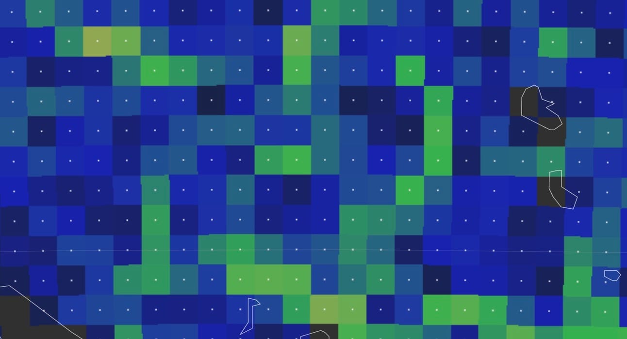
CMEMS GLO_PHY ocean currents with no interpolation
That’s all for now. Thanks for being a member of the e.n.n community. As always, please let me know what you think and any new features you'd like to see. Even though I can’t reply to everything, I read all the feedback.
🌍🌎🌏
